Ishaan
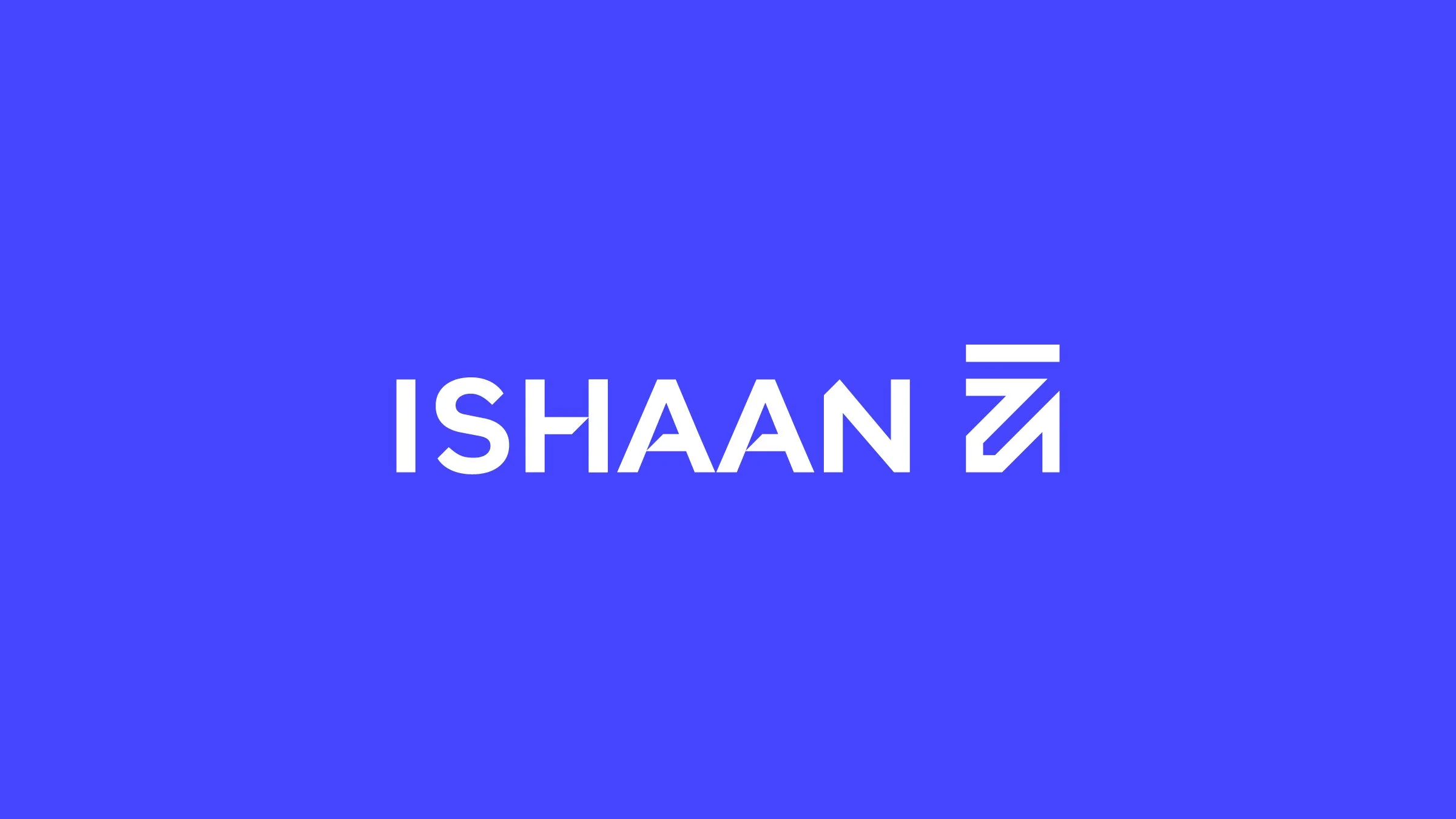
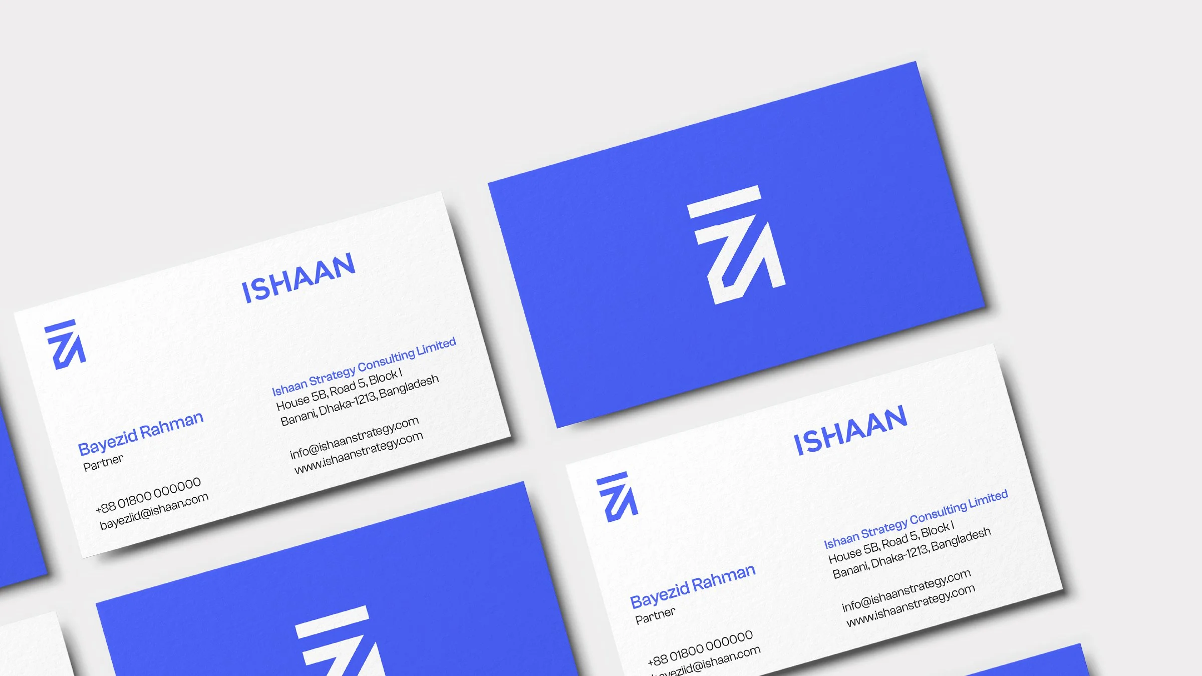
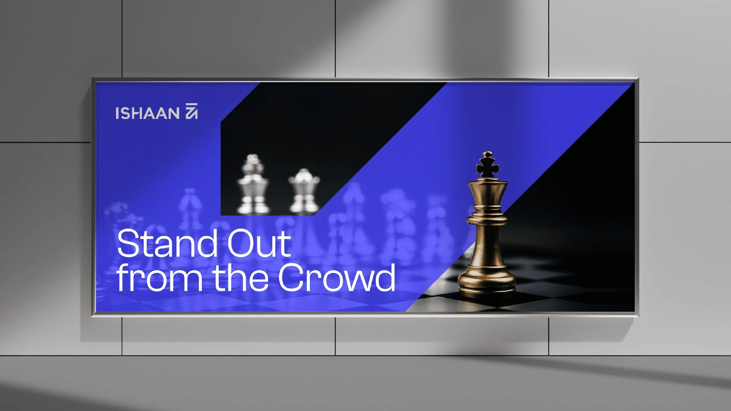
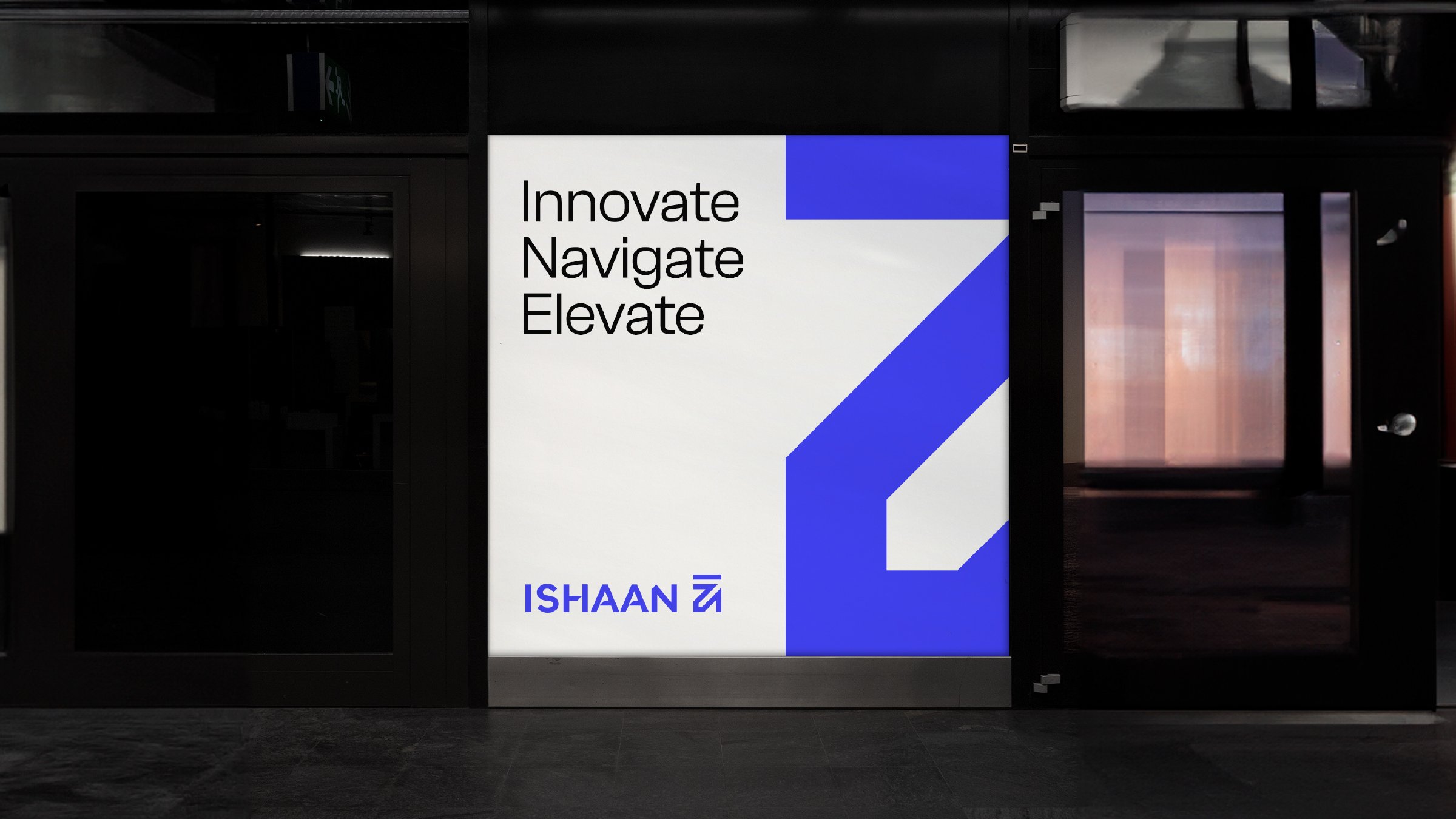
I created a clean and confident identity for Ishaan, a brand strategy firm built around clarity and trust.
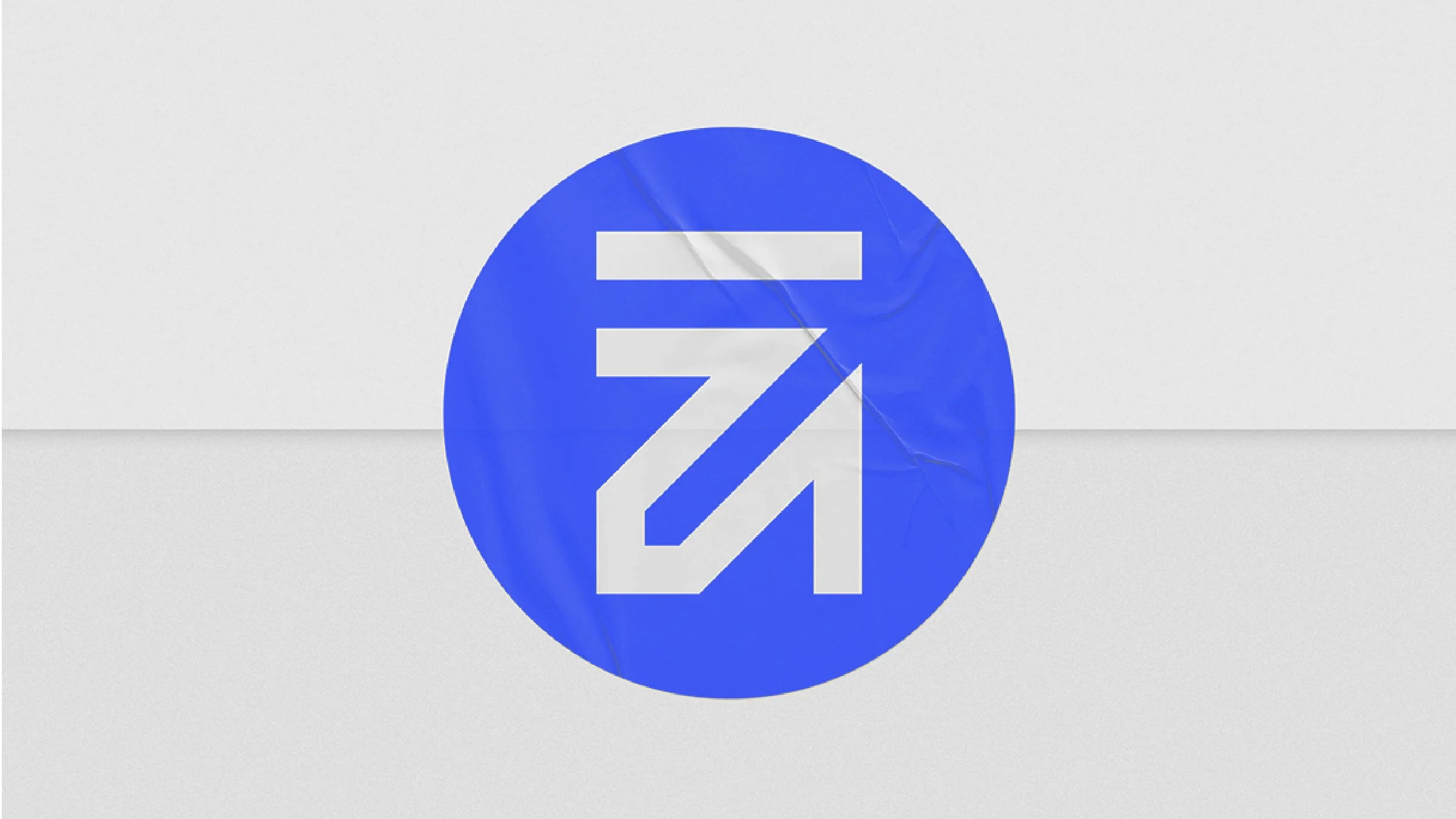
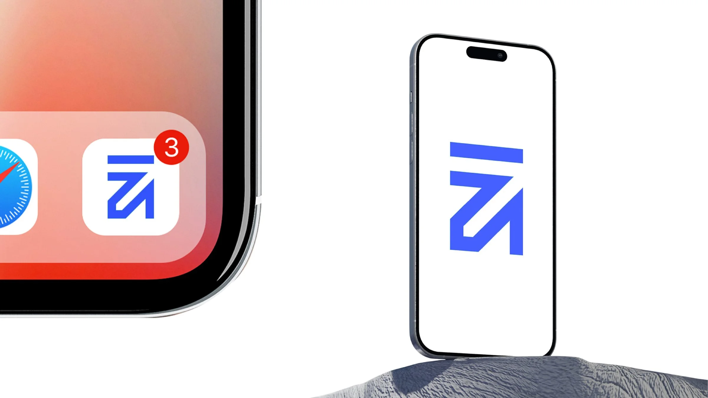
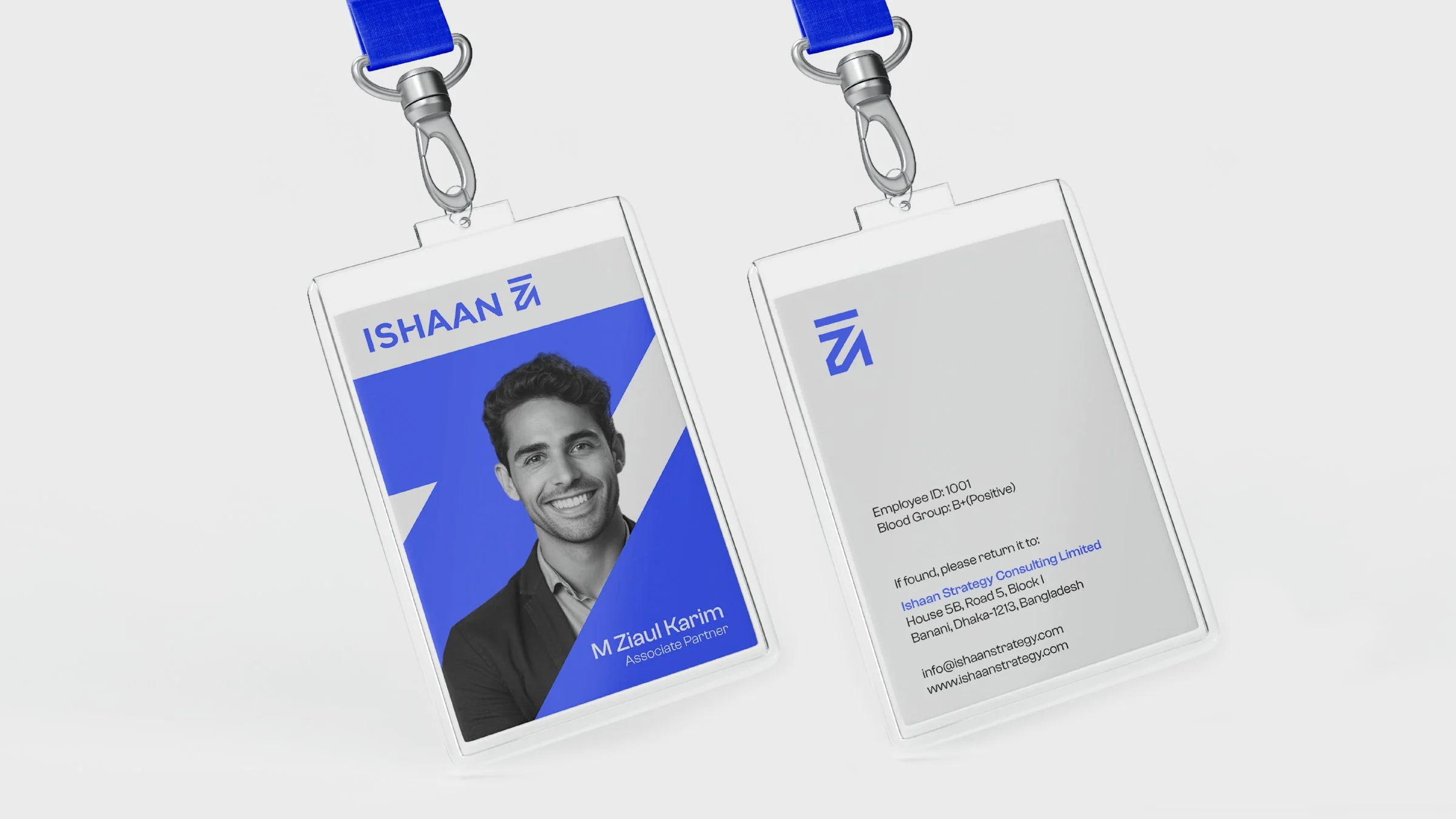
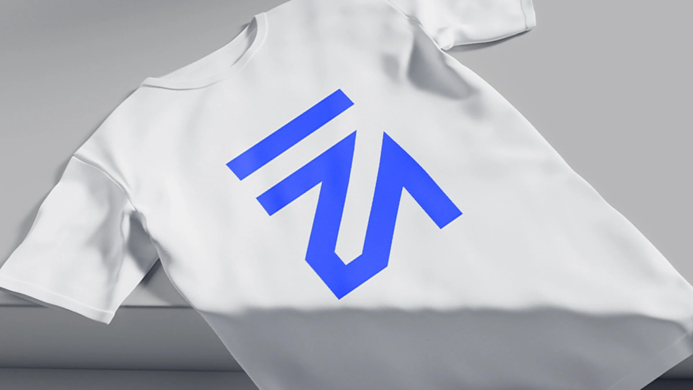
A strong central logomark forms the foundation of the identity and evolves into a flexible system of secondary elements. This gives the brand a consistent presence across its different communication touchpoints.
Role: Brand Designer
Focus: Identity, Logomark, Visual System
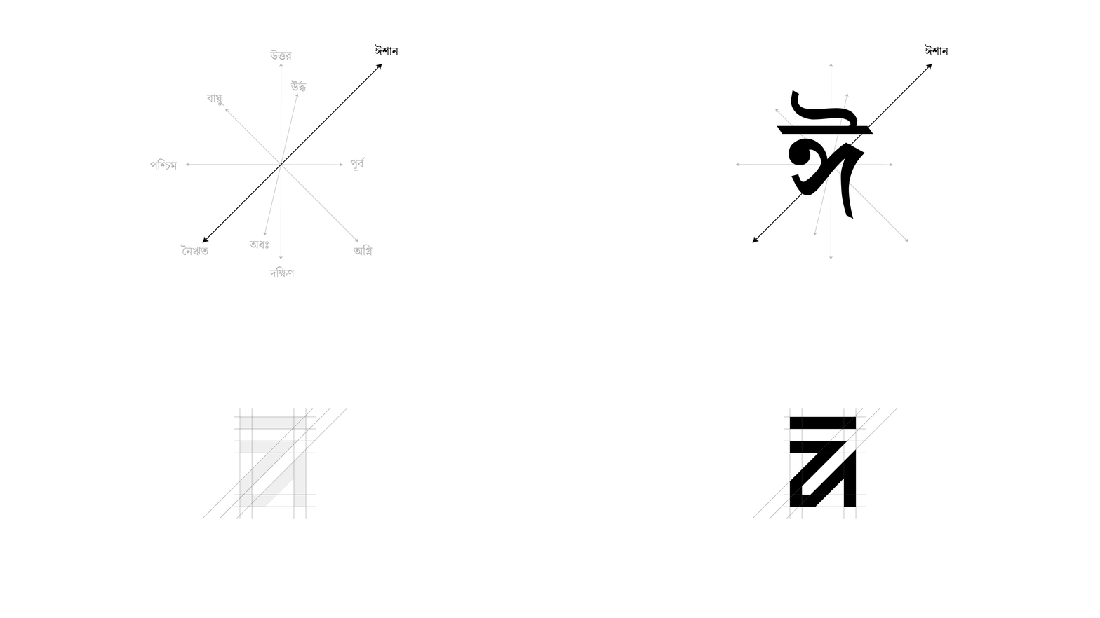
The name “Ishaan” comes from the Bengali ঈশান, denoting the North-East direction in Vastu Shastra—often linked to peace, prosperity, and positive energy.
This idea is translated into the logomark through a play on the character “ঈ”, forming a subtle north-east pointing arrow.