Bengal Wellbeing
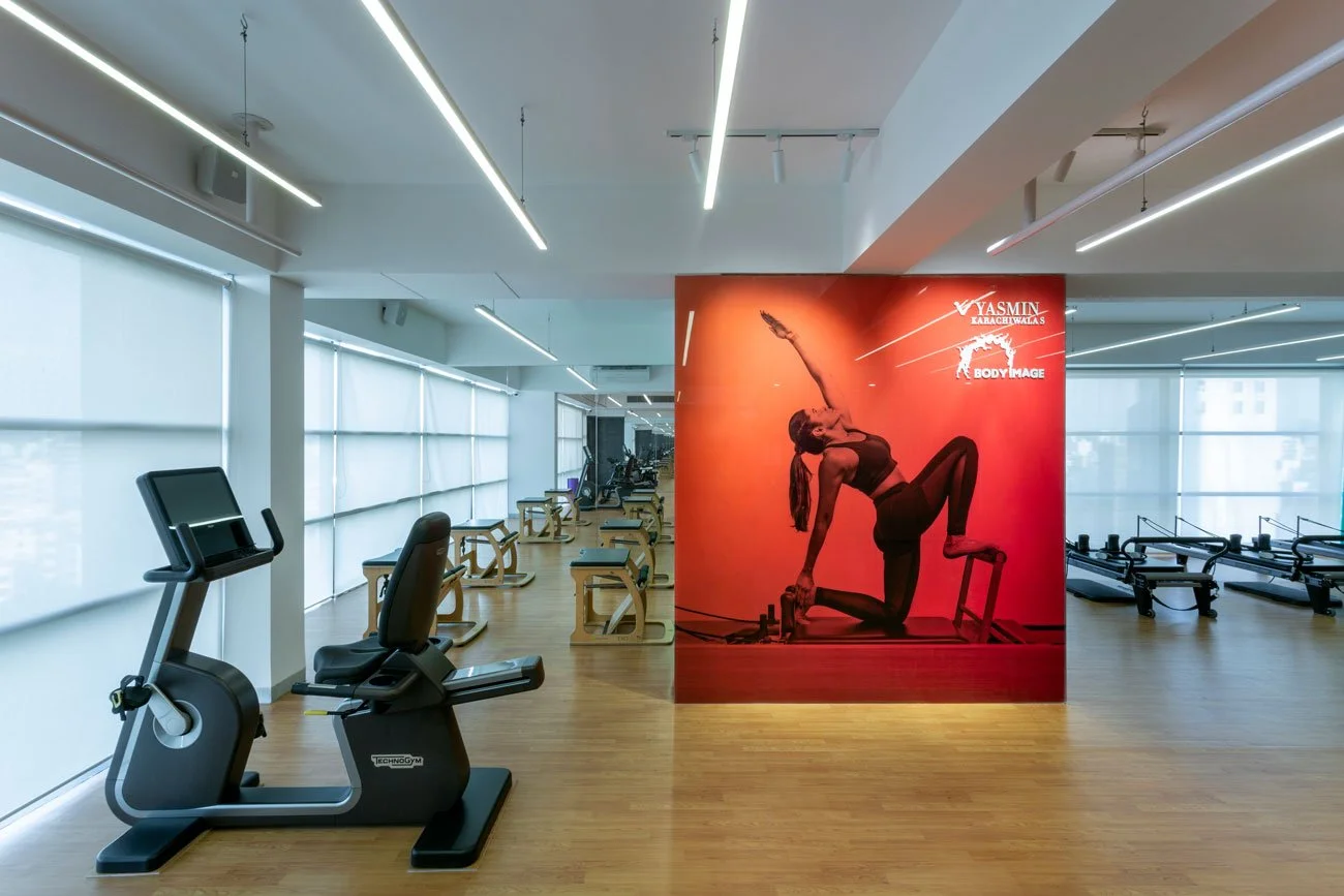
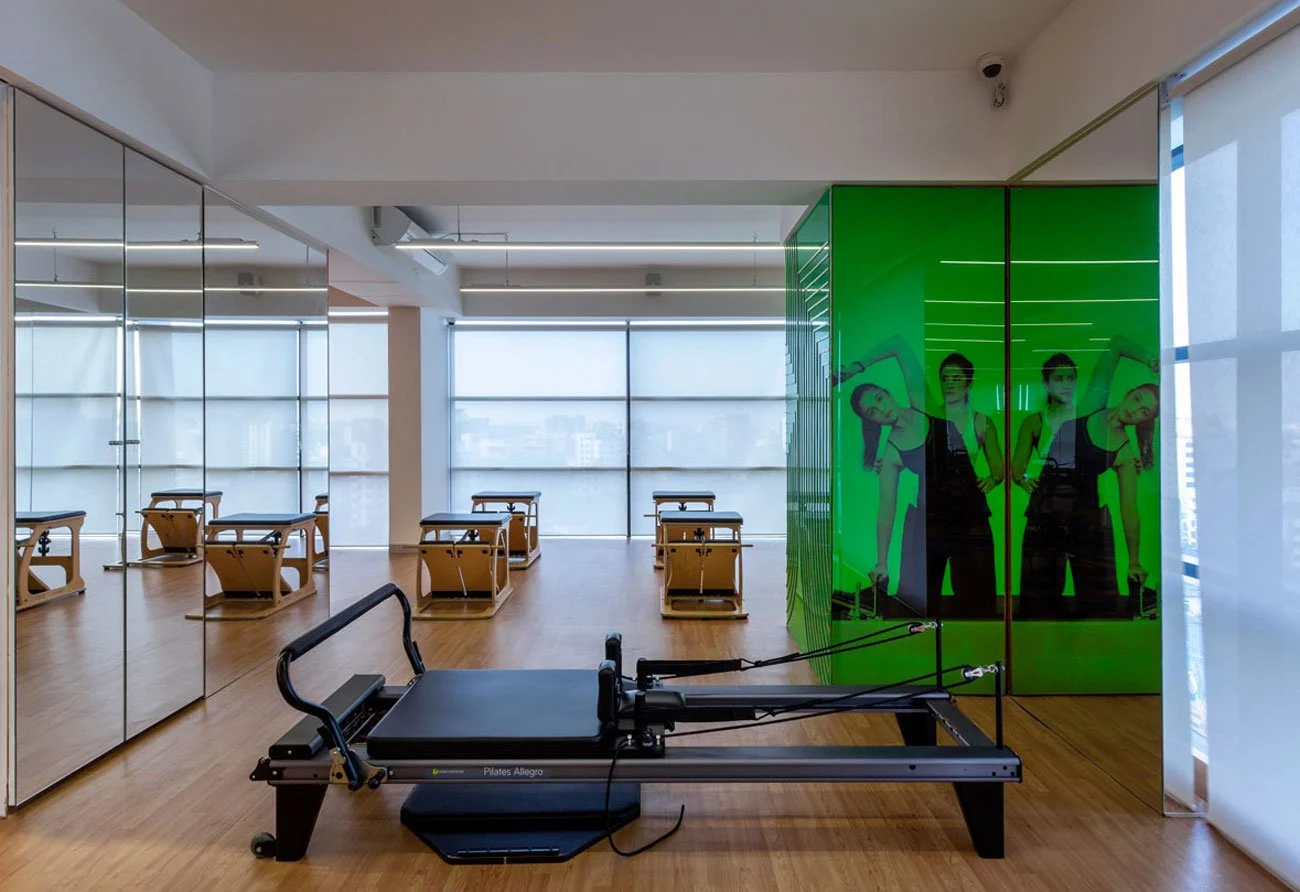
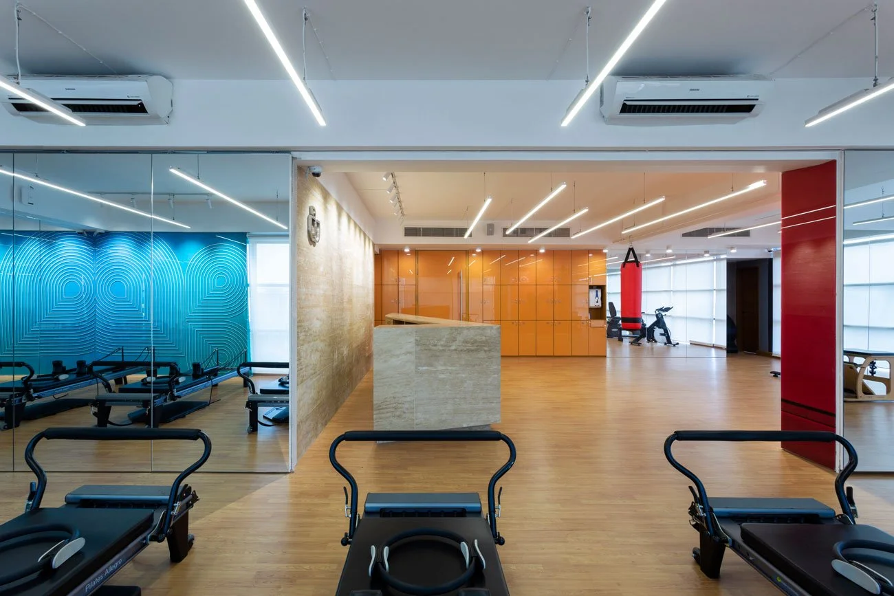
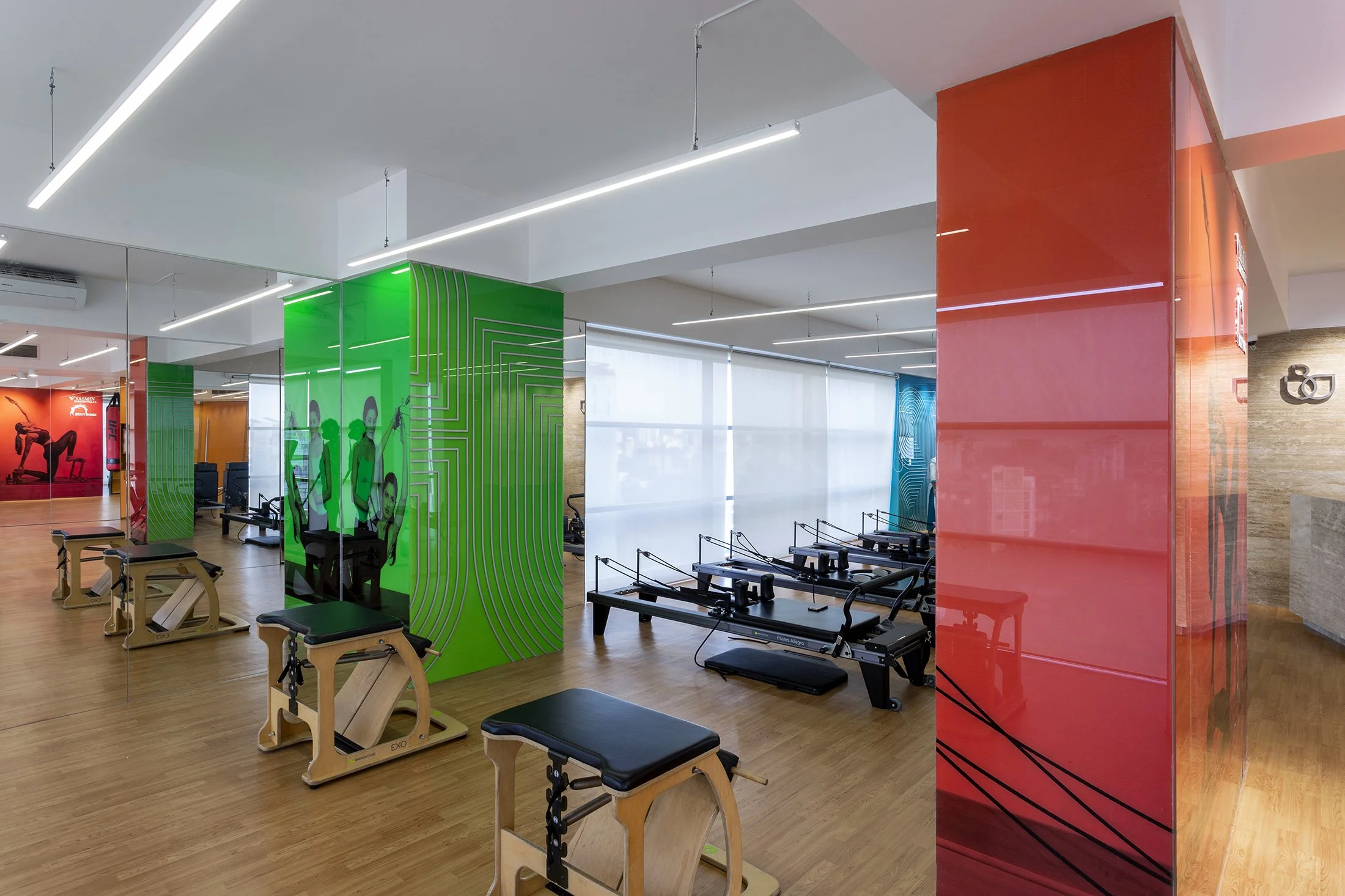
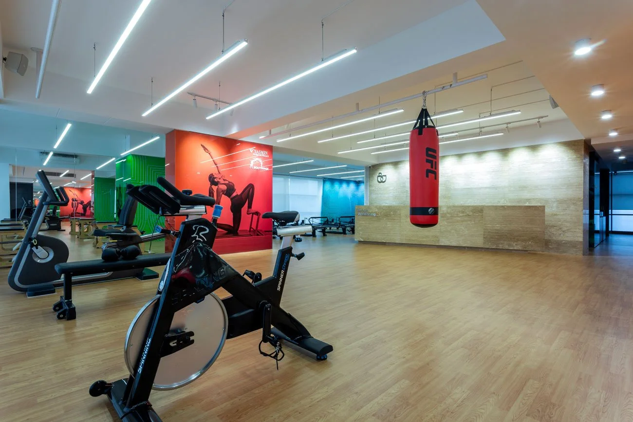
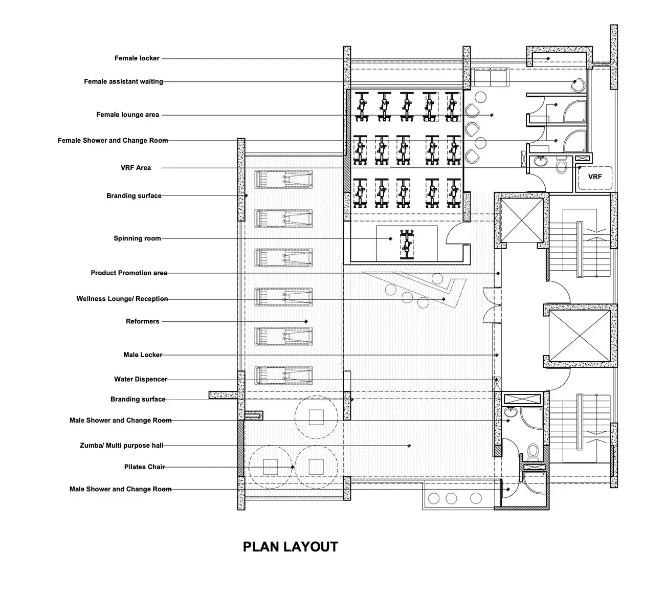
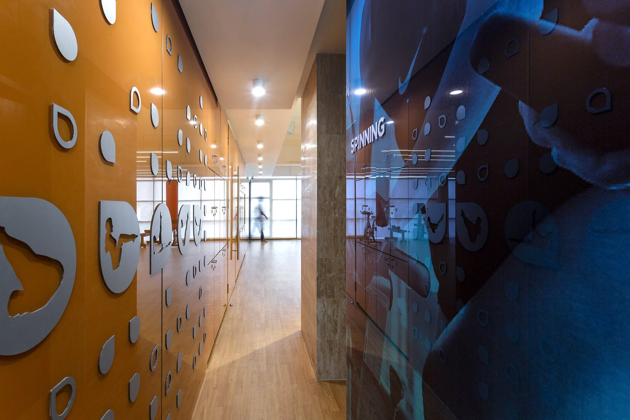
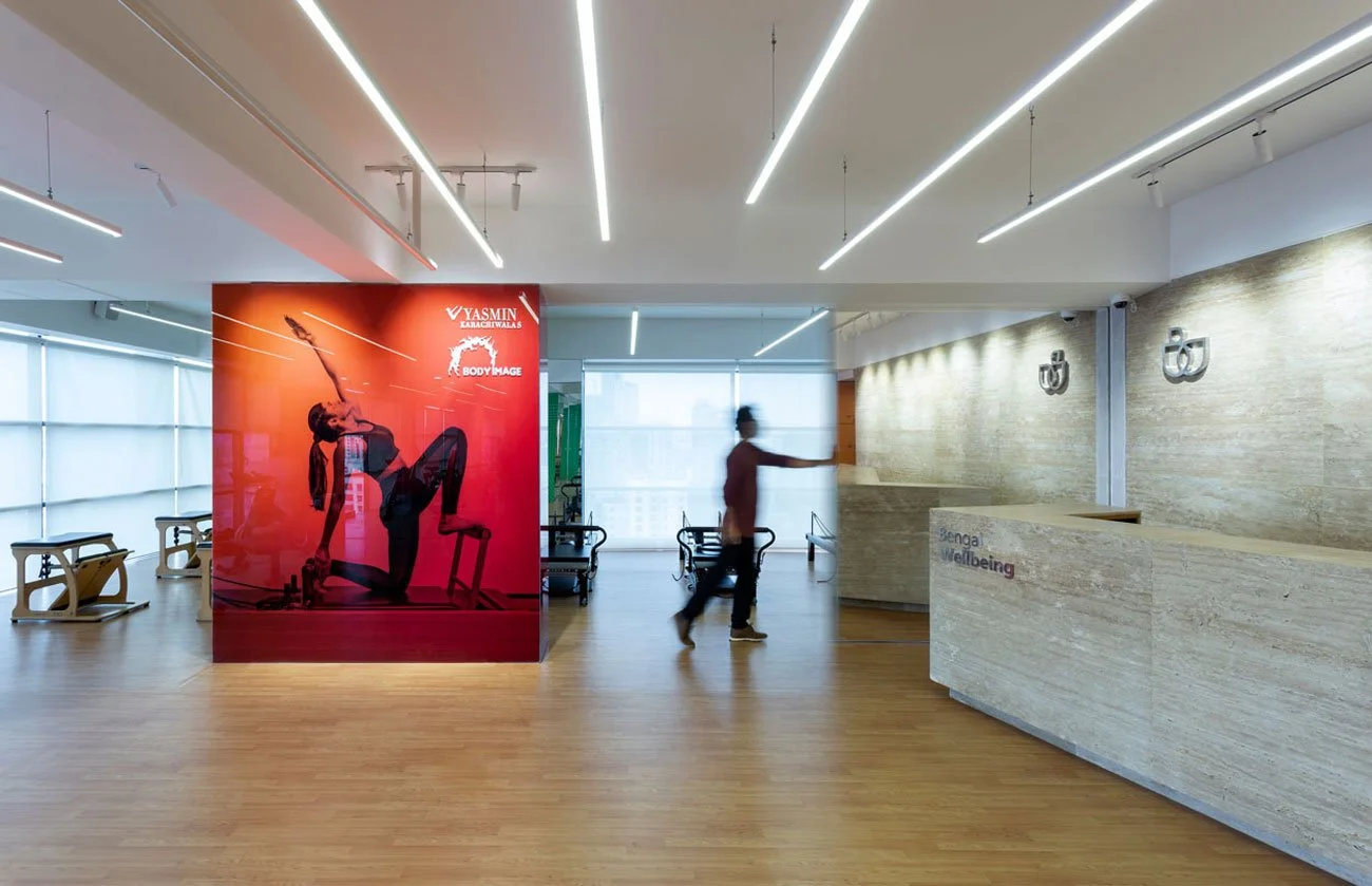
Bengal Wellbeing combines a wellness identity and physical centre into one connected experience. Beginning with a seed-inspired “W” symbol, I developed a visual and spatial language that moves across graphics, materials, colour, and interior details. Travertine and light wood create a calm foundation, while controlled bursts of colour bring energy and reinforce the brand throughout the space.
Role — Brand & Experience Designer
Focus — Spatial Experience, Environmental Branding, Identity System, Material and Colour Language
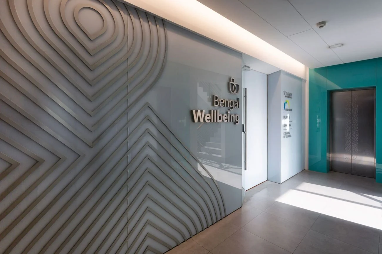
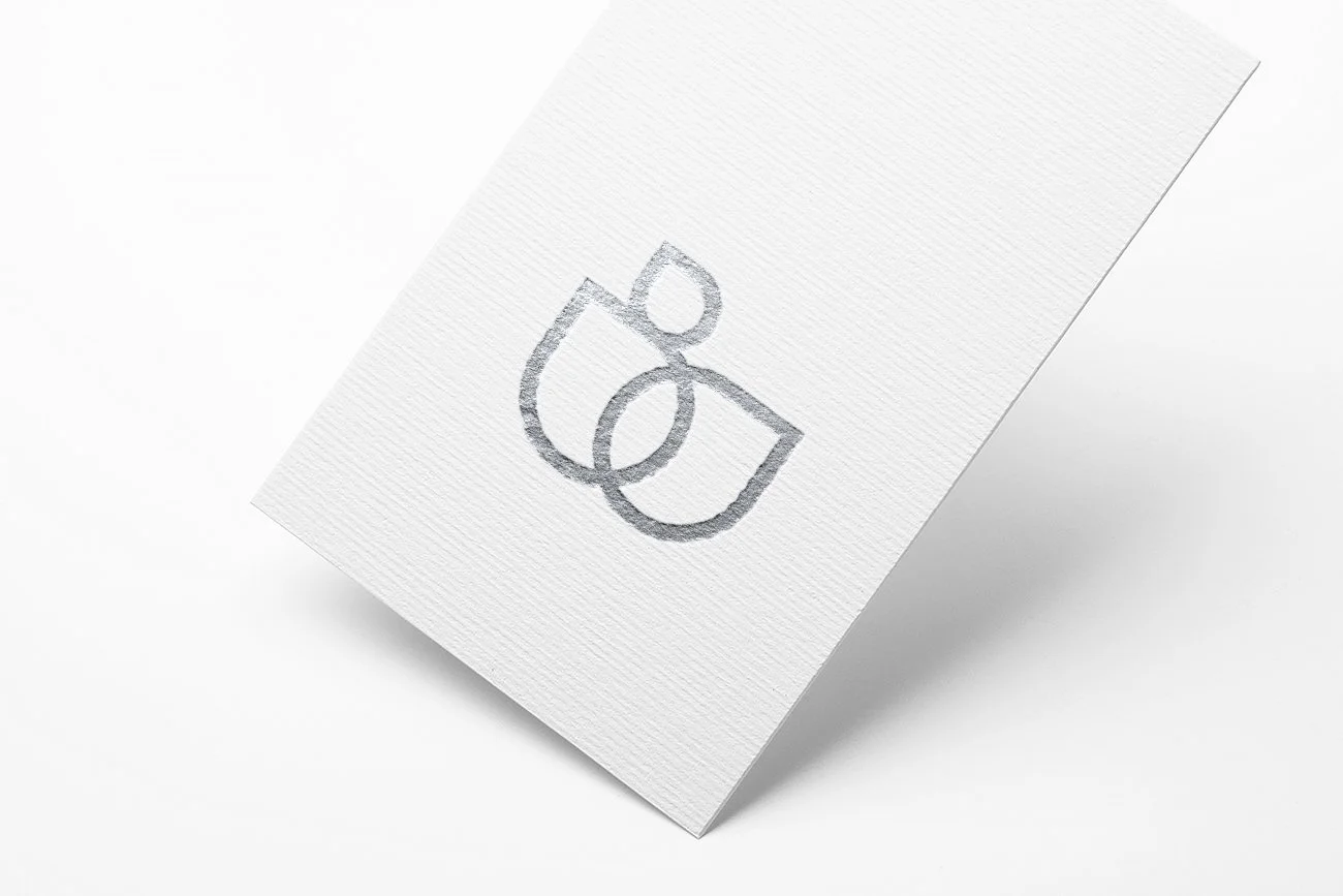
The identity originates from a seed, representing growth, possibility, and personal wellbeing. This form evolved into the “W” logomark and a flexible visual system designed to extend naturally into the physical environment.



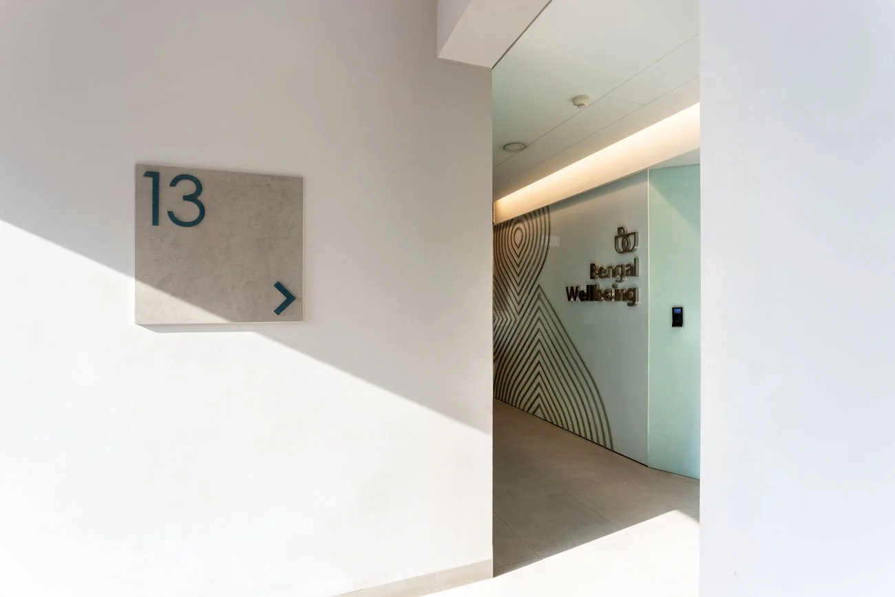
The identity extended beyond graphics into the spatial experience. Its soft forms, controlled colours, and visual rhythm informed branded surfaces and interior details, creating continuity between how Bengal Wellbeing looks and how the centre feels.
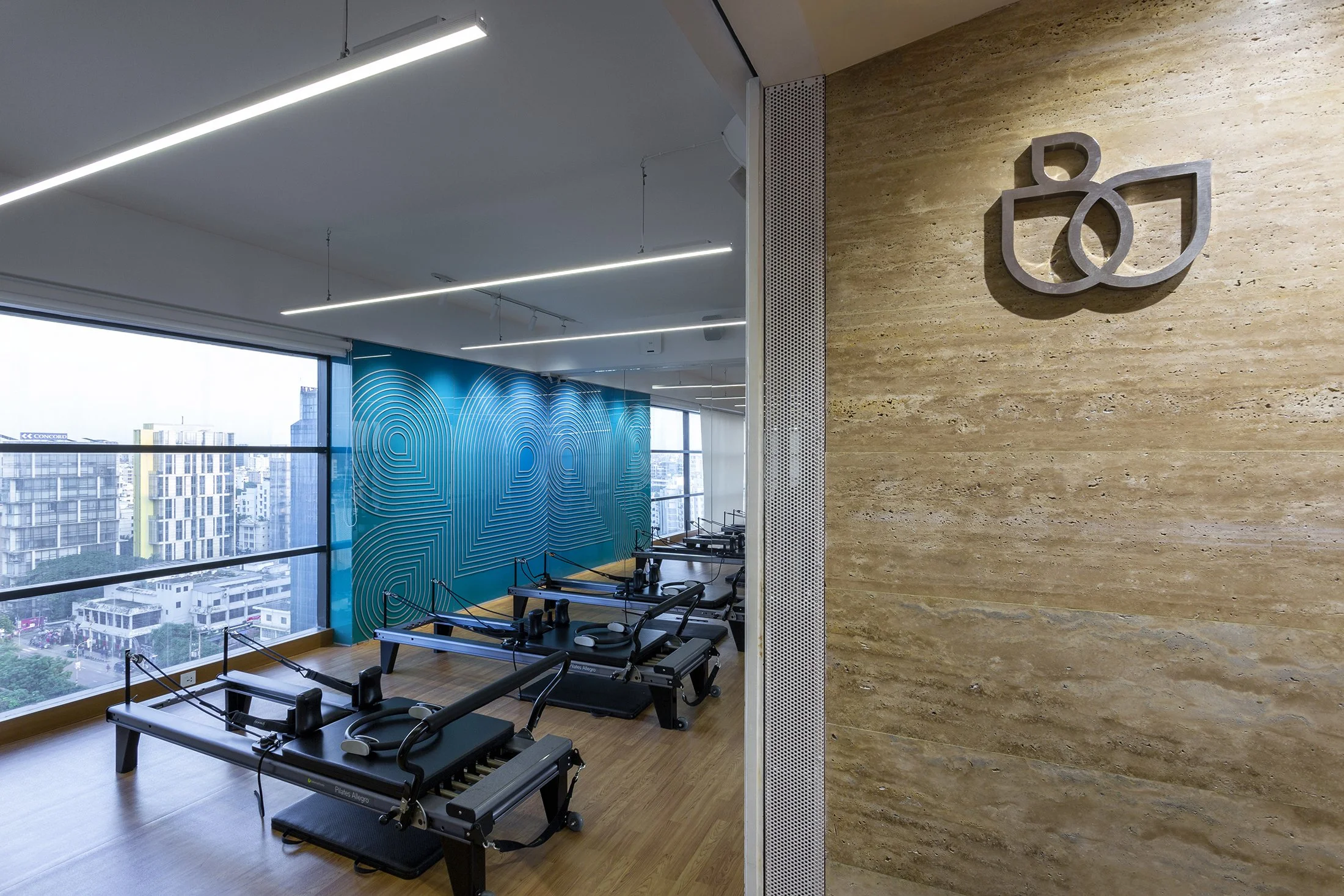
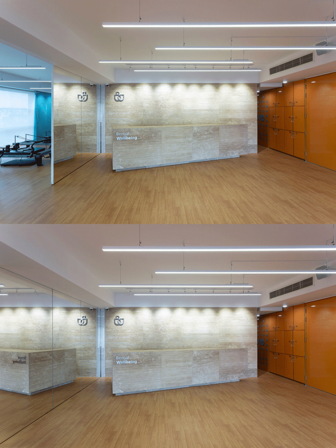
Travertine, light wood, and neutral surfaces establish a calm and grounded atmosphere. Carefully placed colour accents prevent the environment from feeling clinical, adding warmth, optimism, and a recognizable brand presence.